How display resolution affects your website
resolution affects your website
Why Display Resolution Matters for Your Website's Look and Feel
Welcome to the world of websites, where how things look and feel is essential! Your website's display resolution is like the magic behind the scenes that can make or break the user experience.
In this blog, we'll unravel the mystery behind why display resolution matters so much. Whether you're on a tiny phone or a giant desktop screen, the right resolution ensures your website looks its best, making visitors want to stay and explore. Let's dive into the fascinating world of pixels and why they play a big role in your online space!

What is Responsive Design?
Responsive design is an approach to web design that ensures a website's layout and elements adapt and respond appropriately to different devices and screen sizes. In other words, a responsive design allows a website to look good and function well on devices with varying screen dimensions, such as desktop computers, laptops, tablets, and smartphones.
This design technique involves using flexible grids, layouts, and images, as well as CSS media queries, to create a seamless and consistent user experience across different platforms. The goal is to provide users with optimal viewing and interaction, irrespective of the device they use to access the website.
How the screen size play a role?
Picture your computer screens like windows into the digital world. In our mobile-focused era, laptops are winning hearts as they become more powerful and affordable each year.
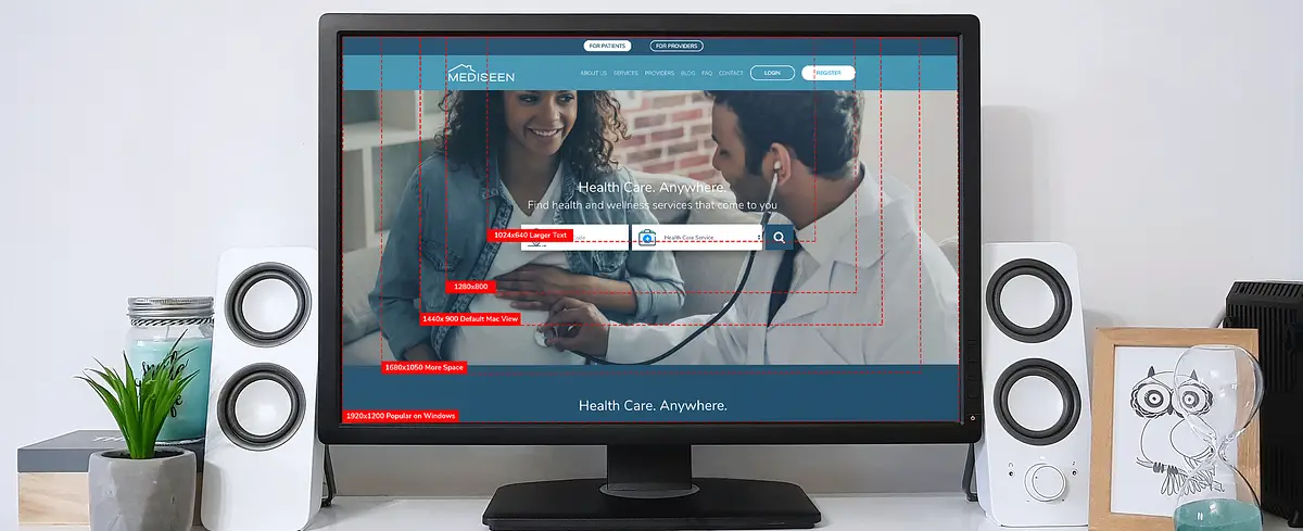
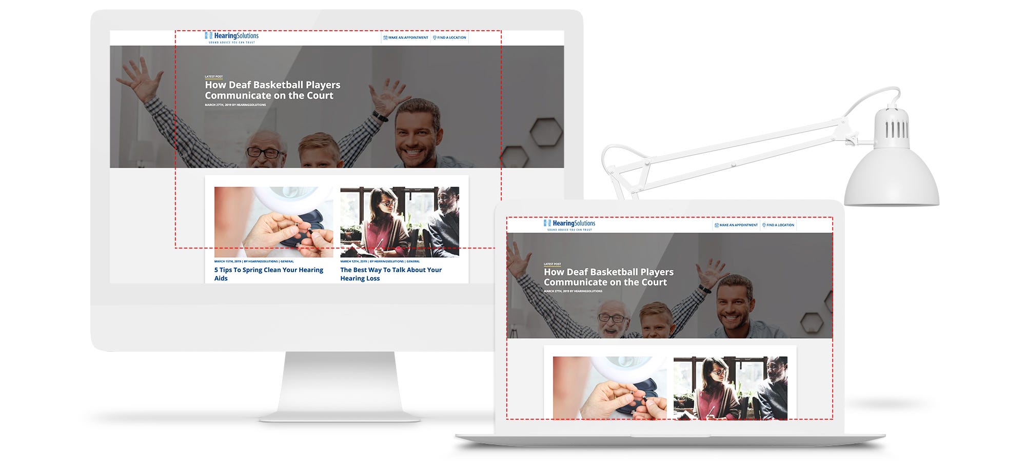
Now, the difference? It's all about size. Desktop screens, those big monitors you see, range from 22 to 27 inches. On the other side, most laptop screens are smaller, around 11 to 15 inches. Even if you're sitting back from the screen like a desktop user, your screen is still about twice the size of a laptop user's. So, when showing them a website, it's like adjusting the view—desktops get a big, zoomed-out version, and laptops get a cozy, focused one.
Imagine a concert stage: The content, like the star performer, stays the same size. On a big stage (desktop), there's more space around. On a smaller stage (laptop), it's more intimate. So, we tailor the view to make sure your website looks its best, whether you're in the front row or the balcony.
Disclosing the Impact: How Display Resolution Shapes Your Website Design
A display resolution is a very important factor that should be taken care of when developing any website because it can affect the website to a great extent:

Clarity and Sharpness: Higher resolutions offer sharper images and text, enhancing overall visual clarity.
Responsive Design Challenges: Varying resolutions require responsive design to ensure your website looks good on different devices.
Page Layout and Spacing: Display resolution influences how your page layout and spacing appear, affecting design aesthetics.
Image and Video Quality: Higher resolutions showcase images and videos in greater detail, impacting the visual appeal of your content.
Loading Times: Higher resolutions may lead to larger file sizes, affecting loading times, and potentially impacting user experience.
Scrolling Experience: Lower resolutions may require more scrolling, influencing how users navigate and interact with your website.
Readability of Text: Lower resolutions can compromise text readability, emphasizing the need for font and size considerations.
Adaptability to Devices: Ensuring your design adapts seamlessly to various resolutions is crucial for a consistent user experience.
Graphic Element Placement: Display resolution determines how graphic elements are positioned, impacting the overall balance and aesthetics of your design.
User Engagement: A well-optimized resolution contributes to a positive user experience, influencing engagement and satisfaction.
Screen Resolution vs Display Resolution: Disclosing the Differences
While the terms are often used interchangeably, it's essential to understand the distinction between screen resolution and display resolution. Screen resolution refers to the number of pixels a device can show, impacting overall clarity. On the other hand, display resolution encompasses the physical number of pixels on a screen, affecting its sharpness and visual quality. This breakdown clarifies the nuanced disparities between these two crucial elements in the world of digital displays.
Display settings on Mac
Adjusting display settings on a Mac is simple. Here's a quick guide:
Resolution:
Open "System Preferences."
Click on "Displays."
Navigate to the "Display" tab.
Choose the preferred resolution from the list.
Brightness:
In "System Preferences," go to "Displays."
Switch to the "Display" tab.
Adjust the brightness slider to your preference.
Night Shift (Reduce Blue Light):
Find "Displays" in "System Preferences."
Go to the "Night Shift" tab.
Schedule Night Shift or adjust the colour temperature manually.
Arrangement (Multiple Displays):
In "System Preferences," select "Displays."
Go to the "Arrangement" tab to configure multiple displays.
Refresh Rate (if applicable):
If using an external display, check the refresh rate in the "Display" tab.
These steps might vary slightly depending on your macOS version. Experiment with these settings to find what suits your preferences and the specific needs of your work or entertainment.
Overcoming The Challenge
Navigating display resolution challenges? Here's our simple guide:
Customized Solutions: We tackle display issues on a client-by-client basis. The key? Clear communication. If something looks off in our design mock-up, just give us a shout. We'll figure out your display resolution and customize the view for your computer.
Communication is Key: Don't hesitate to let us know if things seem awry. Your feedback helps us create a design that fits your screen like a glove.
UXPin Magic: If you're checking out a project through UXPin, it's got your back. The link automatically picks the best-sized design for your screen. Need a specific size? Just ask your designer. You deserve to see a prototype that's a sneak peek of the final product.
Conclusion
Display resolution holds the key to how your website looks and feels to visitors. Whether it's the sharpness of high resolution, the brilliance of a Retina display, or the clarity of 4k, each version shapes the user experience. Responsive design emerges as the hero, adapting your site to different screens.
Remember, it's not about making everything look the same; it's about optimizing for the best experience on various devices. So, as you navigate the world of pixels and screens, keep in mind that the right resolution can transform your website into a visual masterpiece, capturing the attention and satisfaction of your diverse audience.
Ocean Of Tool
YouTube & SEO Tools
Start Using YouTube, SEO Tools & Other Website Optimization Tools, along with L(e)arning Money Making Skills at oceanoftool.com. Digital Marketing, Affiliates, AdSense, Clickbank, YouTube & More. Most Popular: Amazon Affiliates, Google Adsense, Digital Marketing, Website Designing!